Seek Software Inc. 2015 - 2020
|
|
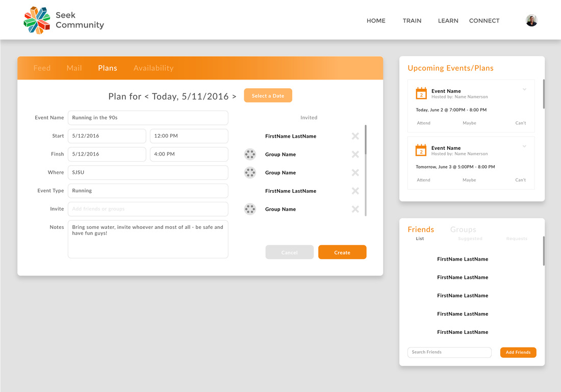
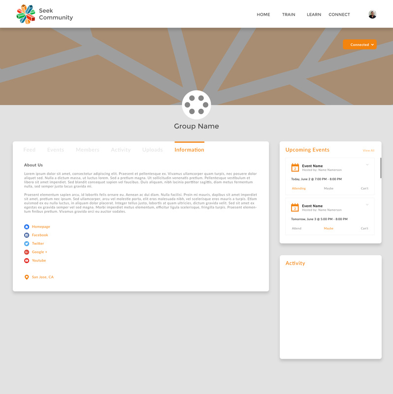
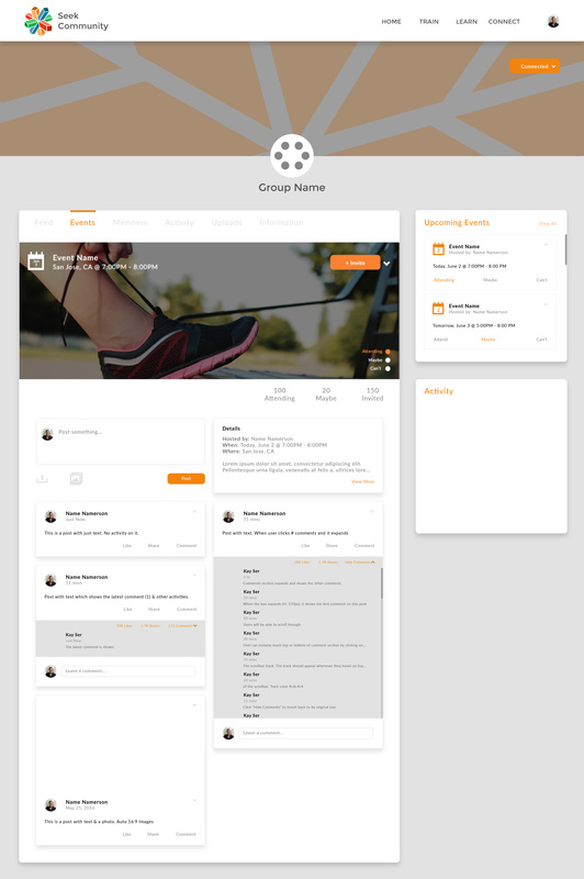
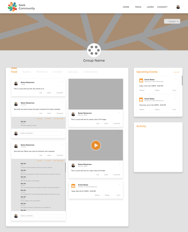
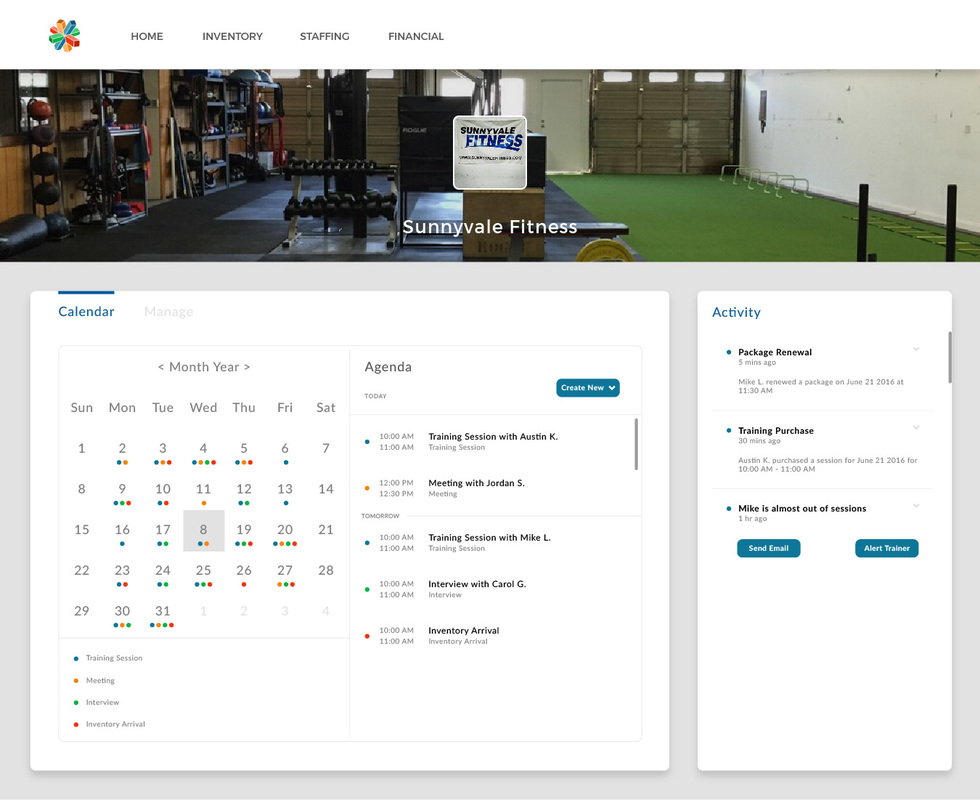
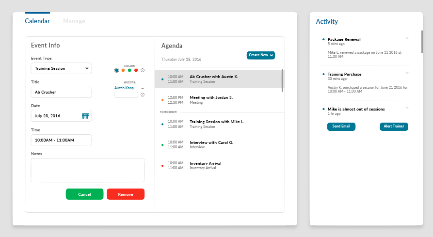
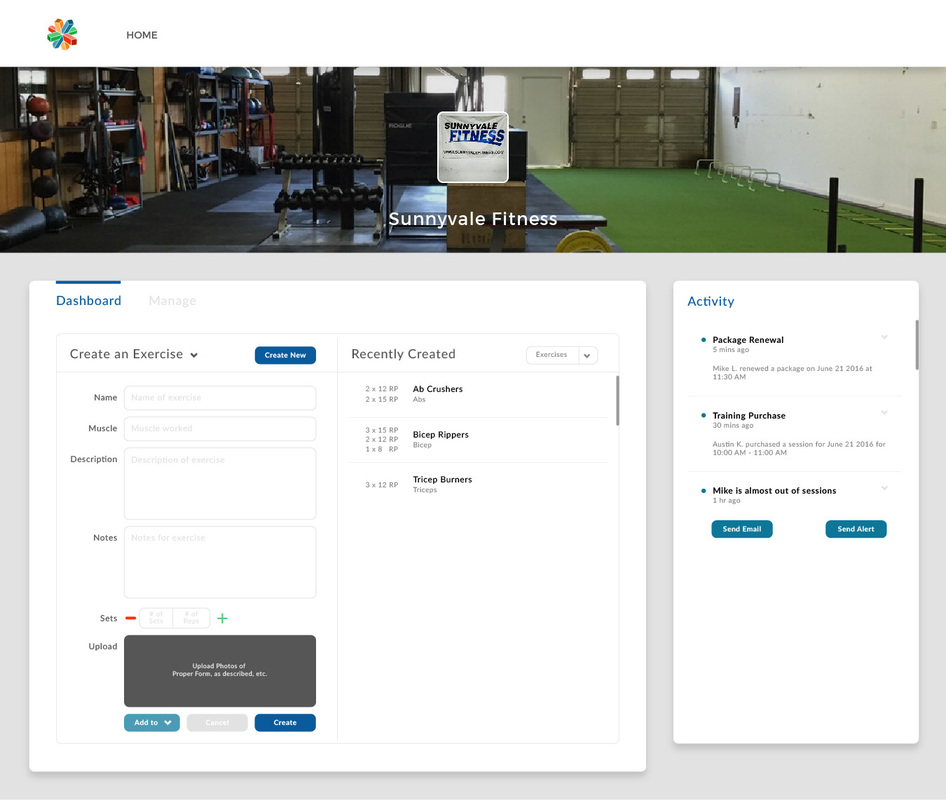
These are a fraction of my designs done for Seek Software Inc., a democratized health platform that lowers health and medical costs while improving health outcomes. I designed both the desktop and mobile versions of the application. The software allowed individuals to match themselves with relevant health information and professionals, so it was critical that the user interface be sleek, straightforward and easy to maneuver. As co-founder of this startup, I gained invaluable industry experience that will continue to serve as a foundation for my work.
|


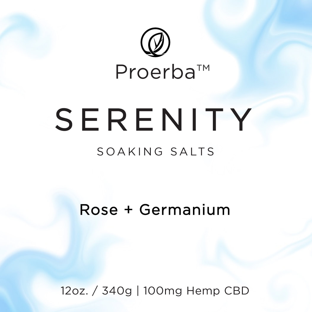
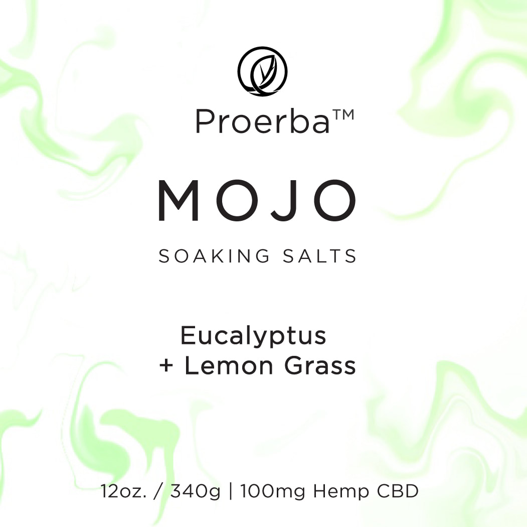
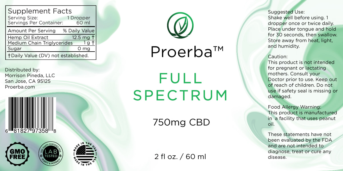
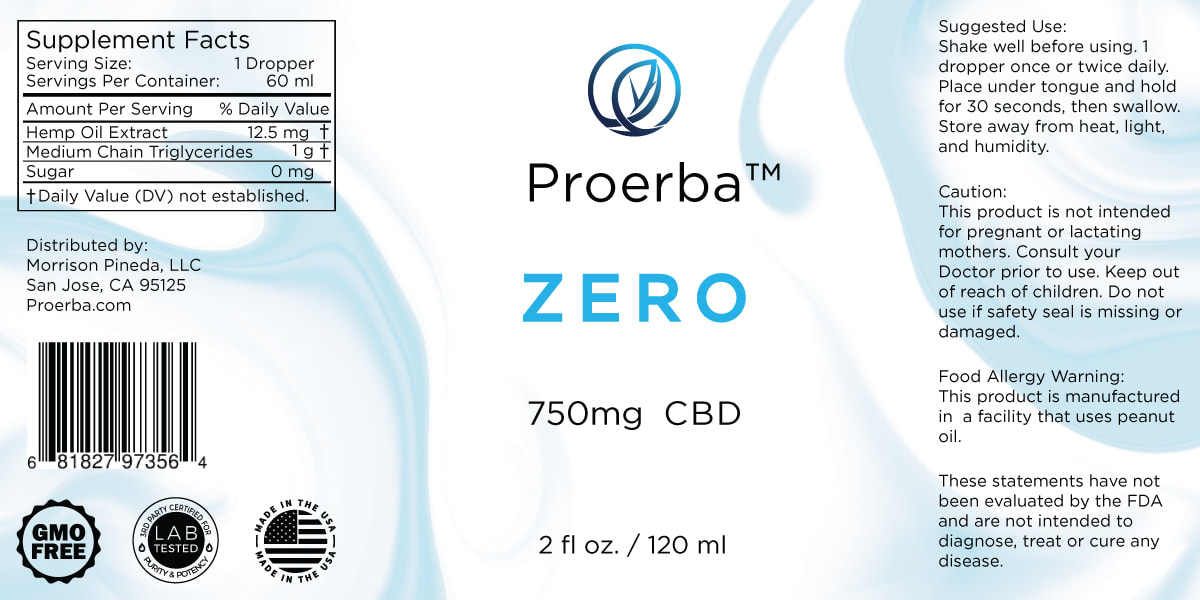
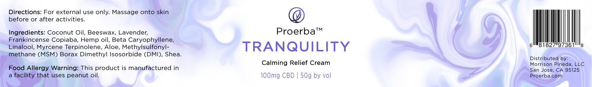
Proerba 2019
|
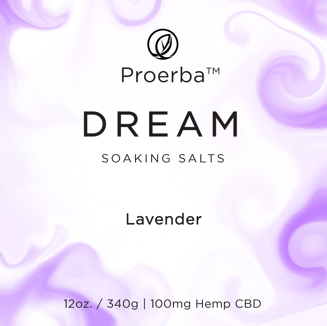
I had the pleasure of rebranding and designing Proerba’s labels for their new set of products, shown in the gallery to the right. Proerba is a CBD and wellness company that complements and enhances individuals’ wellness routines. My designs aimed to convey the sense of balance and wellness consumers experience when using the products.
|
|

Lonely Oak Brewing Company and Pizzeria 2019
|
|
I branded and designed a few projects for a brew pub and pizzeria opening in Gilroy, California; this is their logo I designed. They requested that I work on a few more projects for them once they are more established.
|
Decoding Pelvic Pain - Lavonne Pineda D.C. 2018
|
Dr. Pineda, founder of Proerba, requested that I design and illustrate her chiropractic book, Decoding Pelvic Pain. While this was not something I had previous experience doing, I enjoyed the challenge and provided about ten different sets of anatomical drawings; a few samples are shown to the right, and the whole set can be accessed by purchasing the book.
|
|
Hermitage Brewing 2018
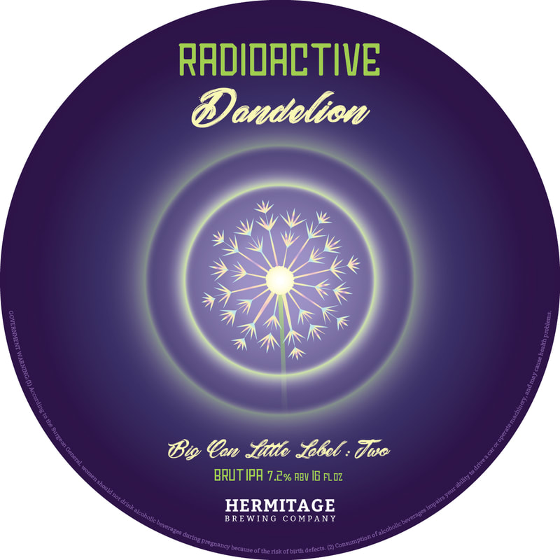
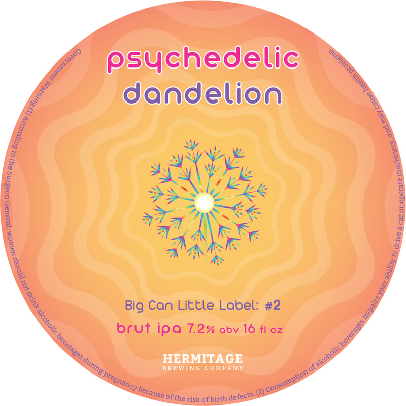


While working as a beertender at Hermitage Brewing, I created some designs for their in-brewery can releases. Rather than their bold-but-simple branding, I did something a little out of the ordinary for them in order to drive sales and highlight the importance of something that stands out on the shelf.
Insight:
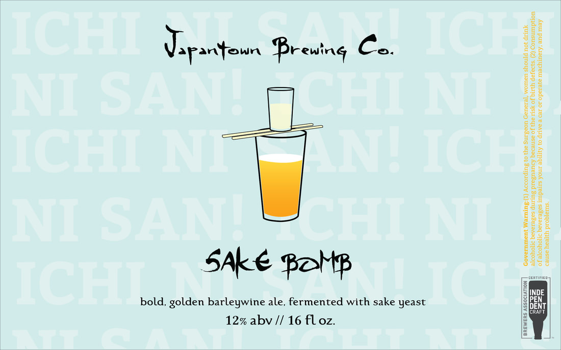
Hermitage also gave me an opportunity to help one of the brewers with his MBA project; I designed some labels for his beer that he showcased in his final presentation. Since he lived in Japantown in San Jose, he named his fictional brewery Japantown Brewing Co. I designed labels for two of the beers he brewed for this “brewery”:
Insight:
- Radioactive Dandelion, Brut IPA: I went for a dark yet glowing approach that allowed the typography and graphics to be well-balanced and to the point.
- Psychedelic Dandelion, Brut IPA: The brewer decided to change the name of this beer from Radioactive Dandelion to Psychedelic Dandelion, so I adapted the previous label design to better match the new name. I wanted a groovy color scheme while maintaining a subtle sense of trippy-ness and simplicity, trying to avoid becoming a Grateful Dead poster.
- The Future is Hazy, Hazy IPA: Stepping away from simplicity and taking more of a creative-concept direction, my label allowed the consumer to be engaged with the story and not just the aesthetic.
Hermitage also gave me an opportunity to help one of the brewers with his MBA project; I designed some labels for his beer that he showcased in his final presentation. Since he lived in Japantown in San Jose, he named his fictional brewery Japantown Brewing Co. I designed labels for two of the beers he brewed for this “brewery”:
- Sake Bomb, barleywine: I wanted to keep the look simple based on the Japanese design: clean and breathable, while having some fun and referencing the proper chant for the Sake Bomb protocol.
- Machu Picchu, pale ale: While hiking there himself, the brewer was motivated to pursue his passion of brewing. So I wanted to reference the sacred, spiritual land and make it bright and stand out as a prolific time that he had in his journey.
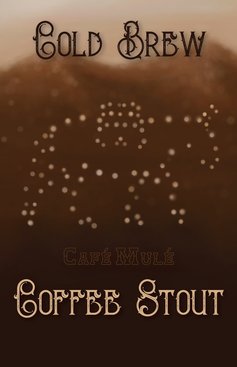
Boise Brewing Company 2016I had the pleasure of working with Boise Brewing in order to help launch their collaboration with Cafe Mule. I created a poster for one of their beer releases that also doubled as its label. With my background in coffee and appetite for craft, I was honored to be affiliated with the Cold Brew Coffee Stout. I also created a four-piece acrylic painting series specifically for Boise Brewing centered around the colors and feeling of coffee (In Art Tab).
Insight: Cafe Mule is named after Richard the Mule, who delivered delicious coffee to trailheads in Boise so that those enjoying the outdoors could also be served a great pick-me-up. I wanted to use dark, stout-like colors that are similar to cold brew. I used variations of brown in the background to create depth, and intended the top to be understood as the beginning of the individual's journey through this flavorful, robust brew. |
|
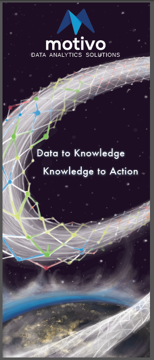
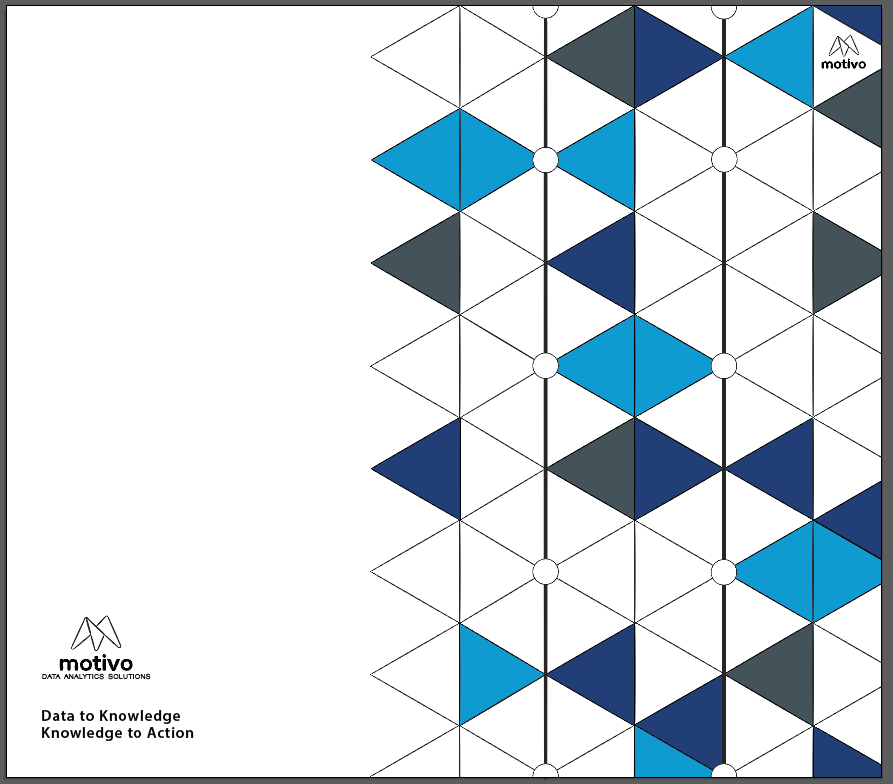
Motivo Data Analytics 2016
|
|
Motivo asked if I would design a couple different items for a presentation where they would be demonstrating their software to potential customers. Shown to the left, I designed an enticing banner, a postcard, and some snazzy folders for them.
|